TonDeVerde, Sustainable Event
About
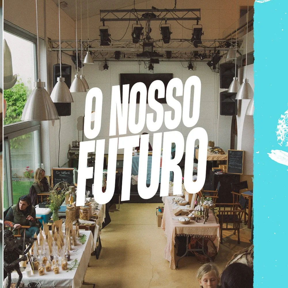
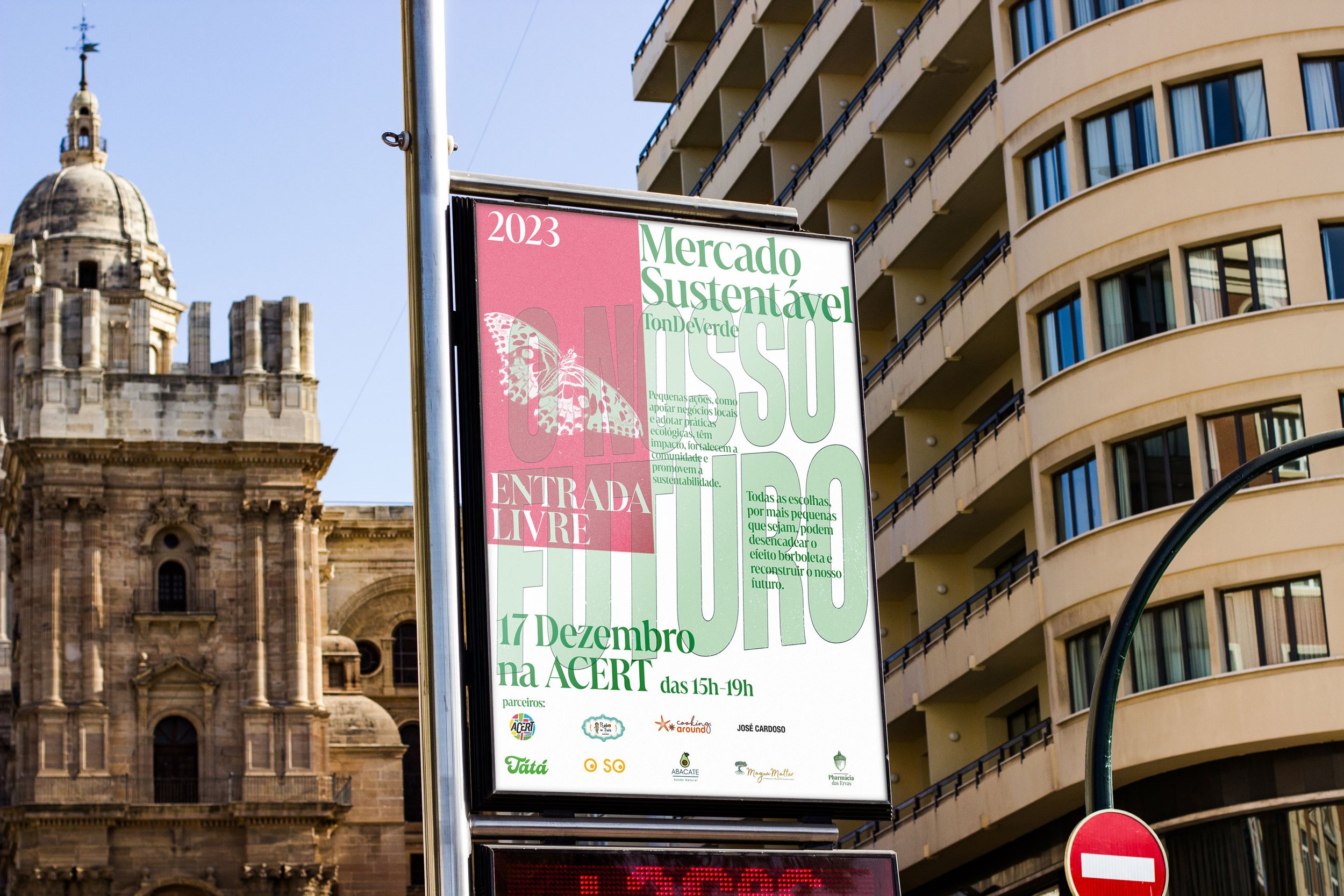
TonDeVerde is a seasonal event focused on spreading awareness of sustainable businesses in Tondela.
I was involved in conceptualizing the storytelling for the event and bring messages of change, hope, and perseverance.
Responsibilities
Editorial, Print, Social Media Content Creation
Role
Freelancing Graphic Designer